Why Bold, Minimalist Web Design Wins in 2025
In a world flooded with content, clean and bold visuals are no longer just a trend—they’re a necessity. As we step further into 2025, brands that embrace bold minimalism in web design are rising above the noise. The combination of simplicity and confidence is captivating, and it works across industries—from personal brands to creative agencies.
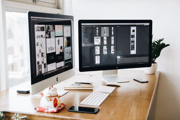
At BoldVision Studio, bold and minimalist design is in our DNA. In this post, we’ll explore why this style dominates modern branding, how it improves user experience and conversions, and how you can apply it to your next website redesign.
1. What Is Bold Minimalism in Web Design?
Bold minimalism is a design approach that balances simplicity with strong visual impact. It strips away unnecessary clutter while using typography, contrast, and color in striking ways.
Think of it like this: Instead of overwhelming the user with options, animations, or text blocks, bold minimalism says, “Here’s what matters—loud and clear.”
Key elements include:
- Clean, grid-based layouts
- Limited color palettes with high contrast
- Large, legible typography
- Whitespace for breathing room
- Focused messaging and intentional content
It’s not about having less—it’s about making more impact with less.
2. Why Bold Minimalist Design Works
✅ It Makes Your Brand Look Modern
Web users associate minimalist sites with modernity, sophistication, and professionalism. Clean design gives the impression that your business is polished, confident, and forward-thinking.
✅ It Improves Website Speed
Less clutter means fewer heavy scripts, images, and design elements, resulting in faster load times—a key ranking factor for SEO and a better user experience.
✅ It Enhances User Experience
Bold minimalist design helps users focus. By eliminating distractions, you guide visitors clearly to your calls-to-action—whether it’s booking a service, viewing your work, or making a purchase.
✅ It Makes Content Stand Out
With plenty of white space and deliberate design choices, your content, visuals, and calls-to-action become the center of attention. This leads to higher engagement and better conversion rates.
3. Where Bold Minimalism Shines
This design style works incredibly well for:
- Creative Agencies & Studios: Showcase your work in clean grids with large visuals and confident type.
- Freelancers & Personal Brands: Establish trust quickly with a polished, professional look.
- Tech Startups: Make complex ideas feel easy and accessible.
- E-commerce Brands: Focus customer attention on products and add-to-cart actions.
At BoldVision Studio, our BoldVision Elementor Template is built with bold minimalism at its core—perfect for creatives, agencies, and modern businesses.
4. Design Tips to Implement Bold Minimalism
If you’re planning to redesign or build a new site, here are some best practices:
- Use 1–2 primary colors and 1 accent color for contrast
- Stick to 2 fonts max—one for headings, one for body
- Keep navigation simple and intuitive
- Let imagery and typography do the heavy lifting
- Avoid animations that don’t serve a clear purpose
- Leave room for whitespace between sections and text
Minimal doesn’t mean boring. It means intentional.
5. Examples of Bold Minimalist Sites That Work
- Apple: Clean layouts, huge product photos, minimal text
- Awwwards winners: Most of the top-rated creative sites use a minimalist aesthetic with bold design choices
- BoldVision Studio Template: Our pre-built design balances white space, striking typography, and high-performance structure—ready for Elementor users
Final Thoughts
In 2025, the most effective websites aren’t the most complex—they’re the most confident. Bold minimalism isn’t just a trend; it’s a strategy for cutting through digital noise and making a lasting impression.
If your current website feels cluttered, slow, or outdated, now is the time to upgrade.